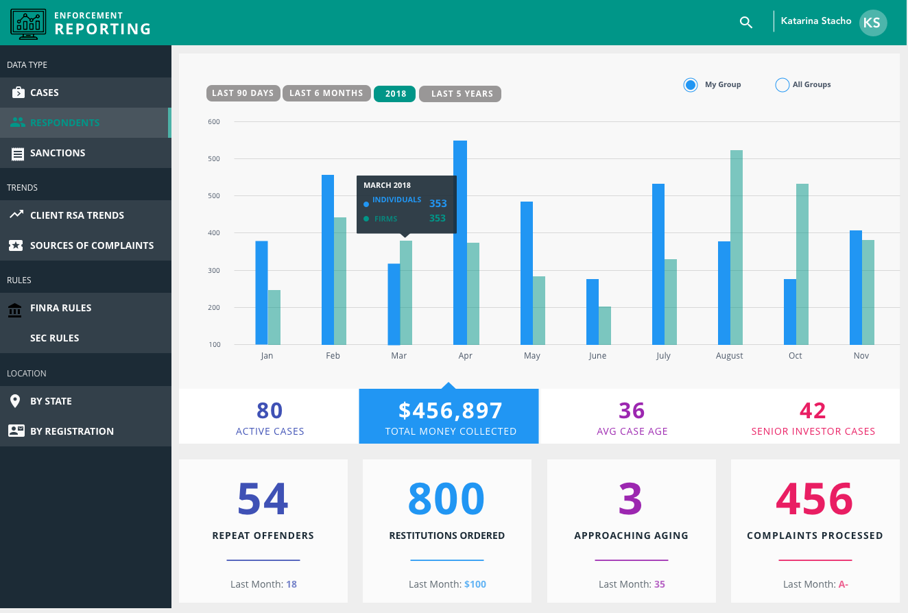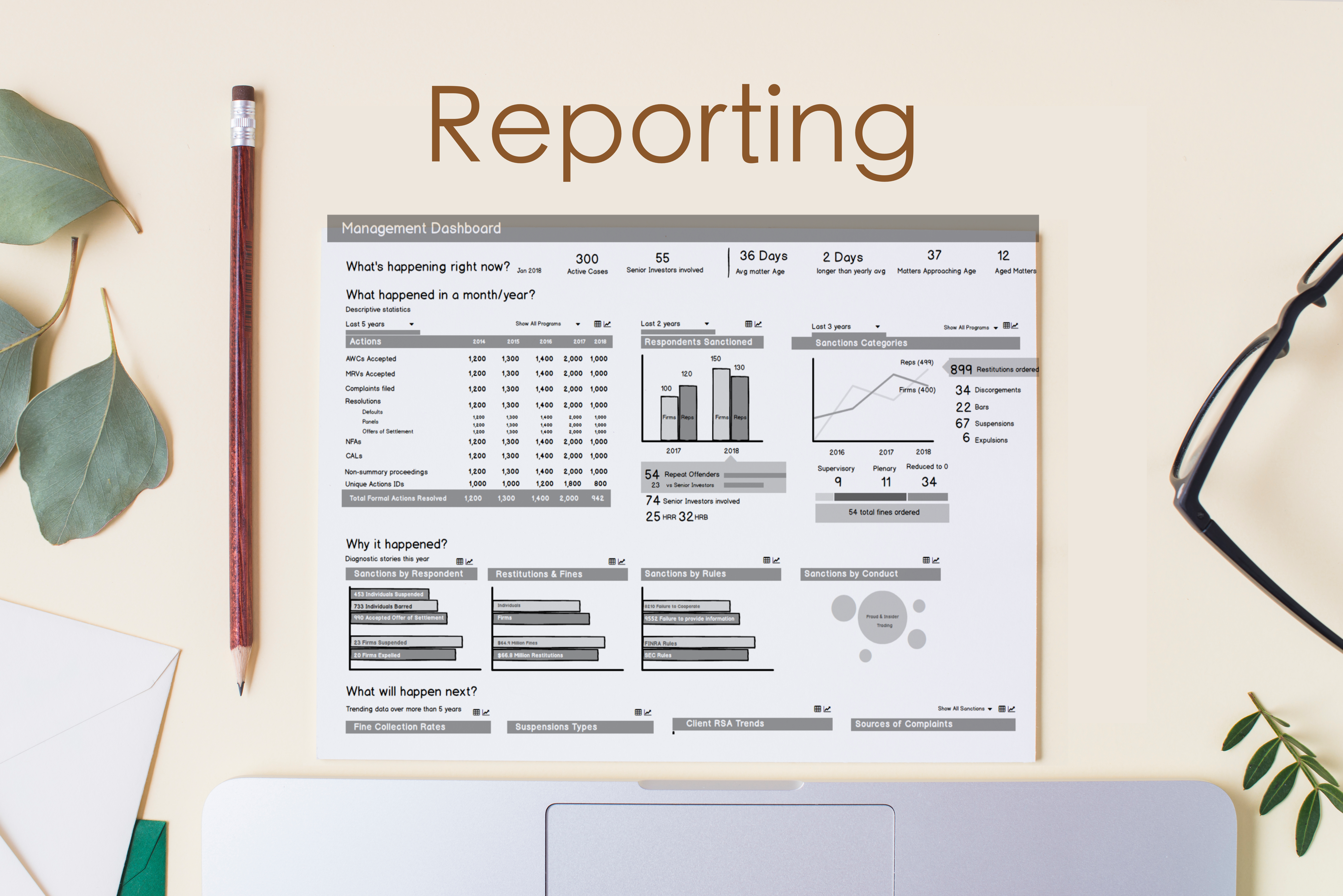
Reporting dashboards communicate enterprise-level case metrics to legal management to track the effectiveness of patterns and sanctions.
The reporting dashboards are crucial tool for any manager. Legal management group needed to understand the effectiveness of their work and active engagement with our clients (exchanges).
The goal of this project was to quickly find out where the dream dashboards and the reality cross. New dashboards need to help drive more informed decisions on business operations such as staffing and efficiency. The ability to pull in information from all of the key sources and automatically consolidating it into a logical, understandable format was critical.
1 Product Manager, 1 Information Architect, 3 Business Analysts, 6 Developers, 2 Designers
After reviewing all user needs, their goals and the data currently available, I have started with researching of what story the successful dashboards tell. I have found that all reporting dashboards should answer the basic : What's happening right now; What happened last week, month, year; Why it happened; and What will happen next.
I created several versions to achieve effective form of bar graphs to increase the ability to immediately extract items by comparing their size and I also had a goal to strongly avoid pie charts (ask me why). I have started with few paper sketches that management shared with me and a design goal of creating a simple, interactive and easy to analyze dashboard I have started with Balsamiq.
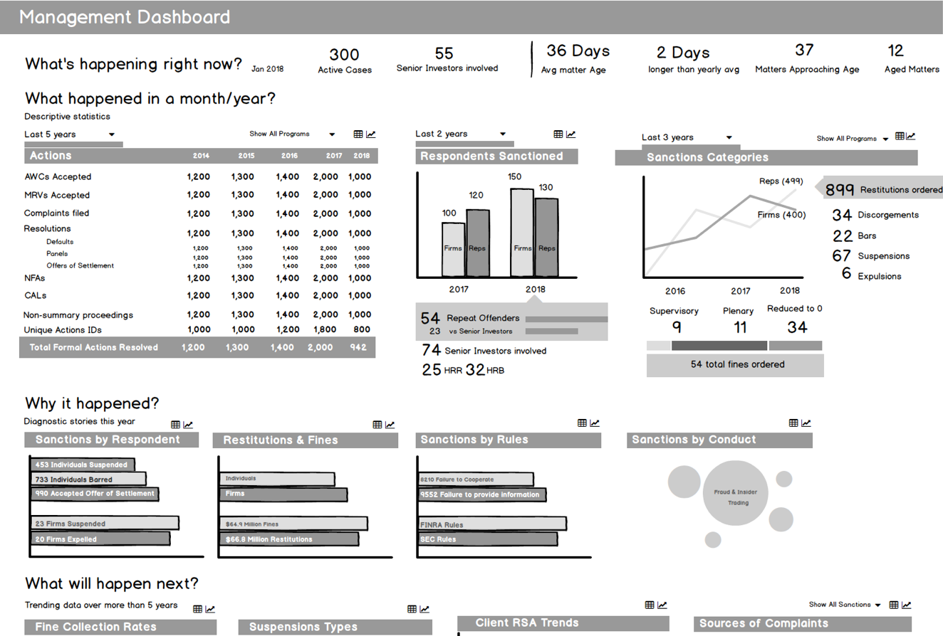
In final desings I highlighted the important data by using the color theory and used primary color while understanding the theory of opponent colors. Then I used the spatial location and two-dimensional shapes as easiest and most accurate to perceive. Then I shared the dashboard sketches with users.