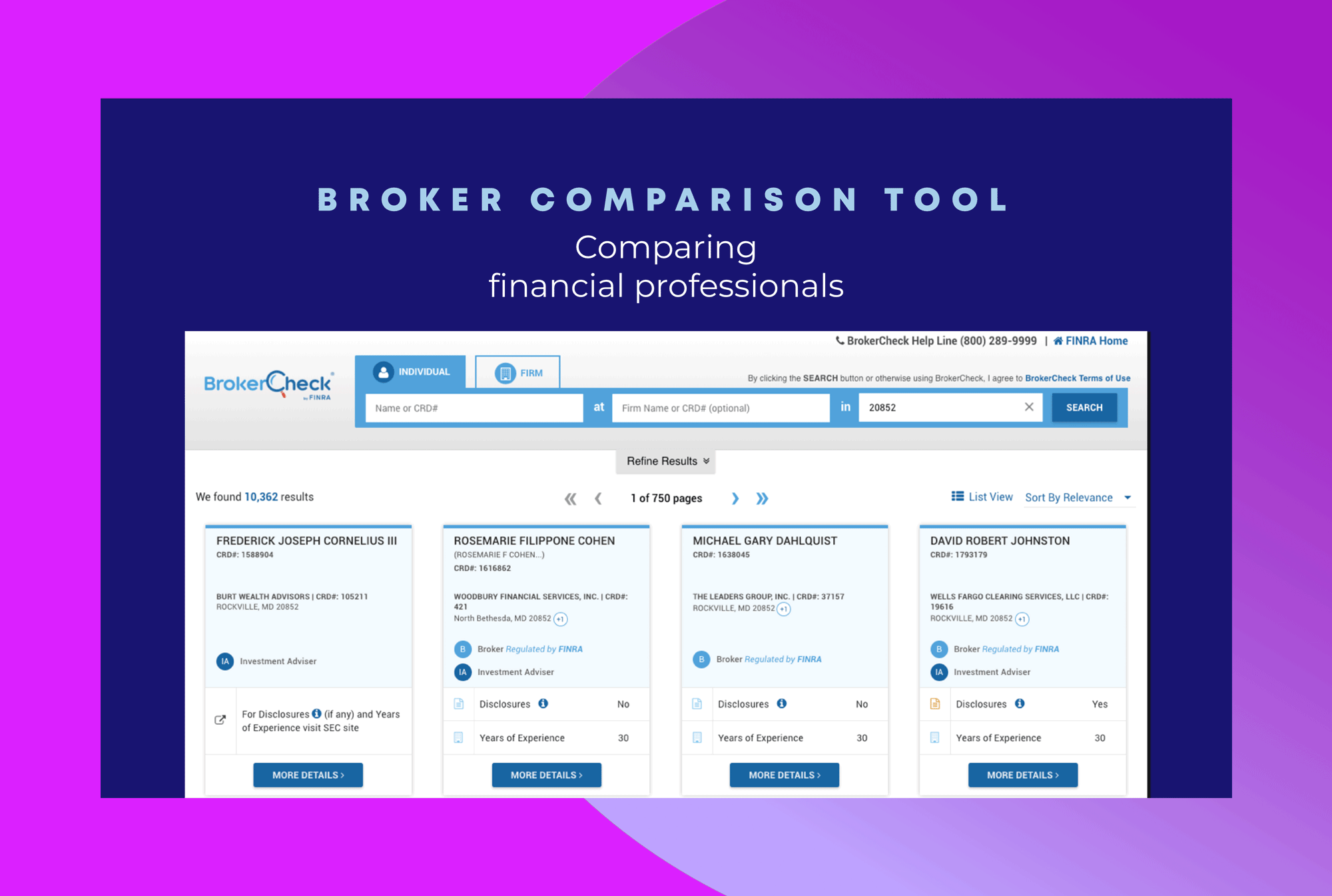
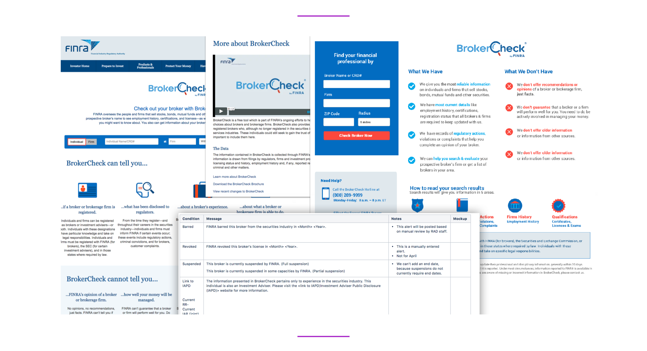
BrokerCheck is an online search tool that provides information about financial advisors, brokers and brokerage firms and their regulatory history to a general public.
BrokerCheck allows general public to research the professional background history of brokers. It is connected to a central registration depository, a database of all brokerage firms, investments firms, brokers and financial advisors in all states.
The goal of this project was to modernize and improve compare and search tools and help its users to make better sense of the significance of various events by simplifying language and removing industry jargon. We had many ideas about rate and compare features, however when validatiing the cross between business and user needs, we realized not all of the user needs can be met by regulatory authority.
1 Product Manager, 1 Information Architect, 3 Business Analysts, 4 Developers, 2 Designers
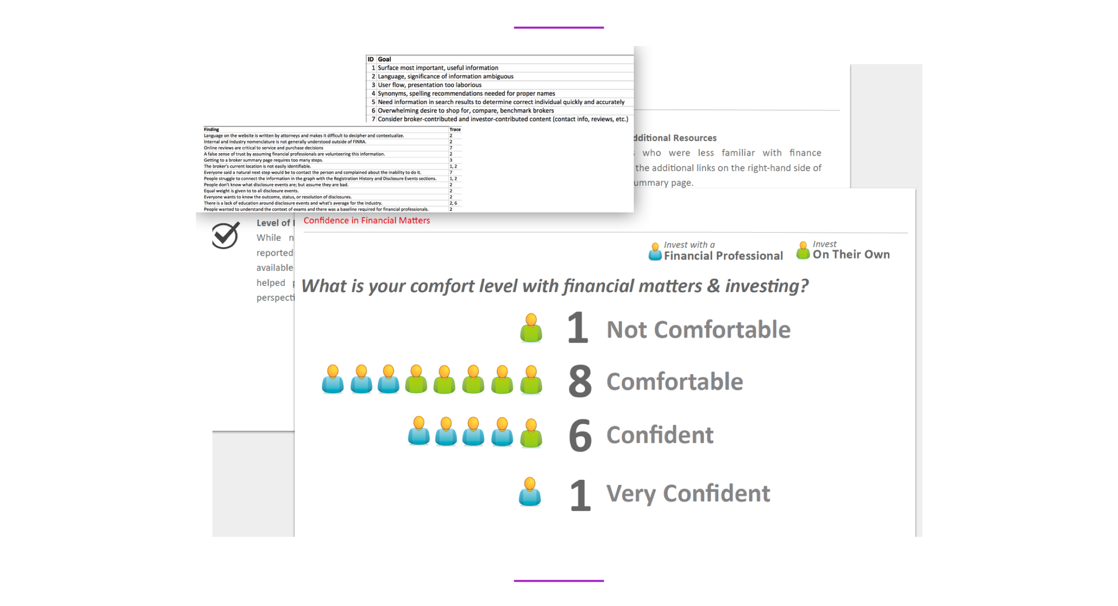
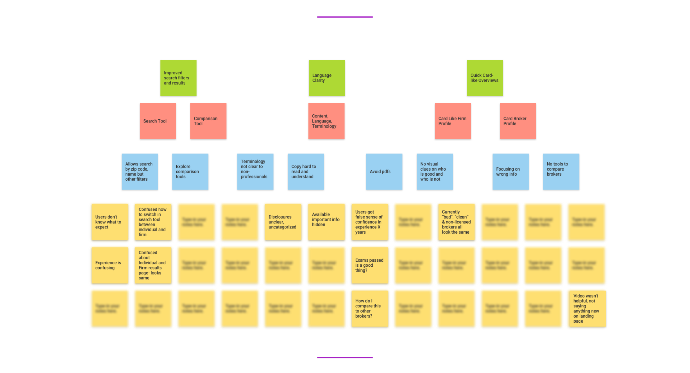
The team first focused on the results of several usability studies—including Charming Robot, ForumOne, plus informal in-house studies—and created a usability problems matrix. We used the matrix to inform all aspects of the user's frustrations and pain points.
I helped to analyze and organize all content available to public about the brokerage firms, brokers and financial advisors. This inludeded personal details, the areas of expertise but mostly all disciplinary disclosures that the regulatory entity oversees. To help us understand the differences between brokers, we created a profile of "good, no-longer licensed and barred from industry" brokers. This helped the whole team to understand the content better.
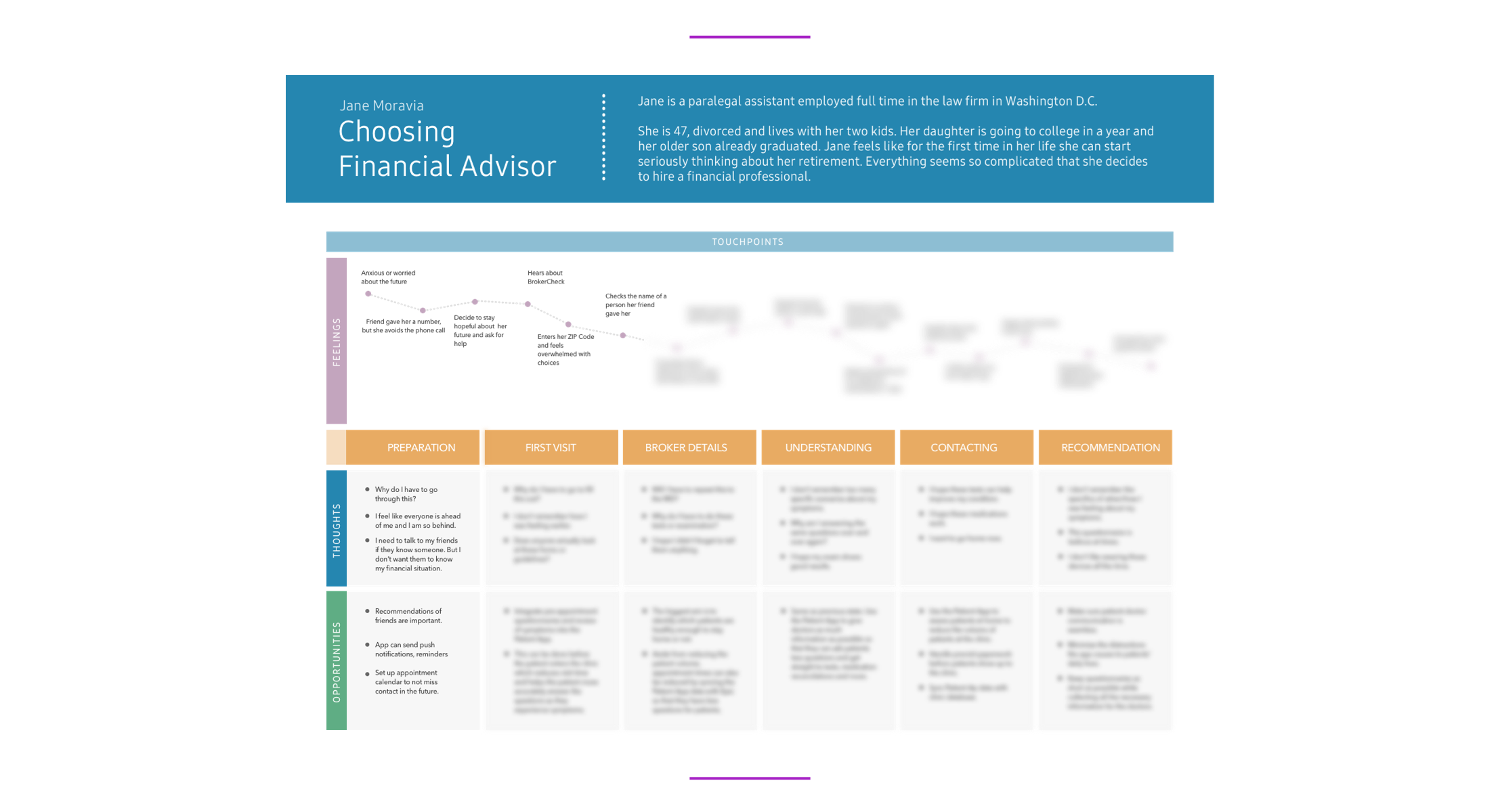
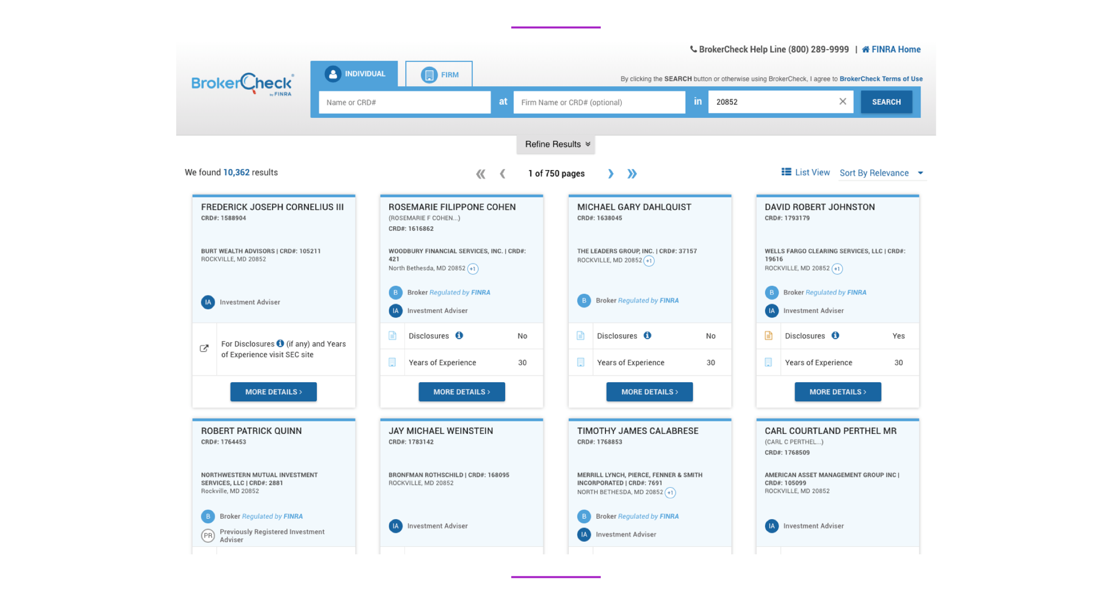
We also separated our end-users into 3 groups: the primary users as members of a general public ; brokers themselves with intent to research other firms and brokers; and a group of the regulatory internal users looking for quick overview of firms or individuals while doing regulatory research. As we ranked the goals by its importance to users, for all, the main focus quickly became a good faceted and filtered search and a comparison tool.
The ability to surface the most important, relevant information quickly came on the top of the list. The need to be able to understand the significance of various events reported via BrokerCheck was the 2nd most important task. Majority of our users felt overwhelmed and confused by industry jargon and and improving the language and educating public became also a top priority.
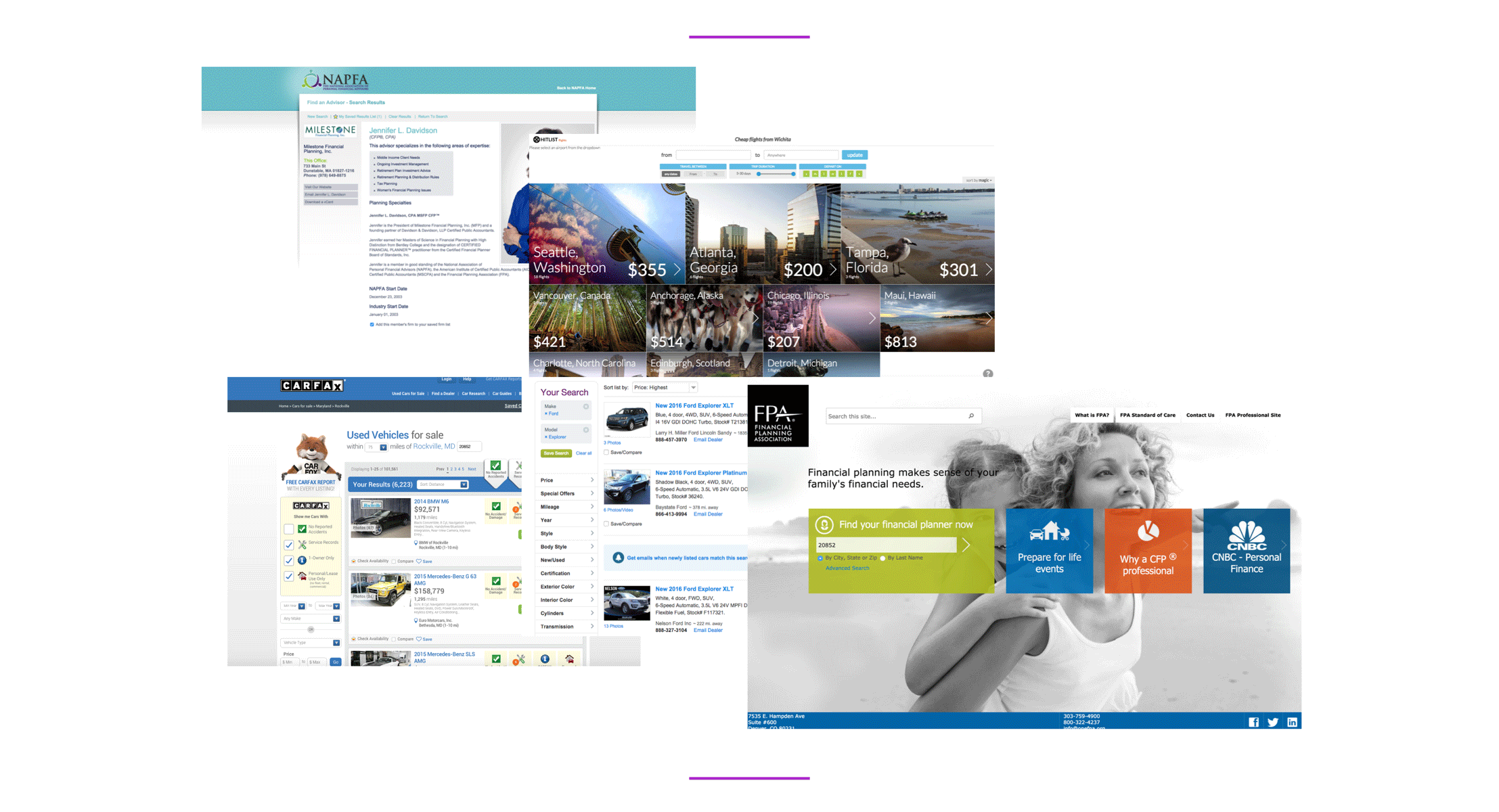
I have researched similar financial professional comparison and search tools and evaluated its features. But I didn't stay only within the fintech industry, I have researched the search patterns on several travel booking and car shopping websites.
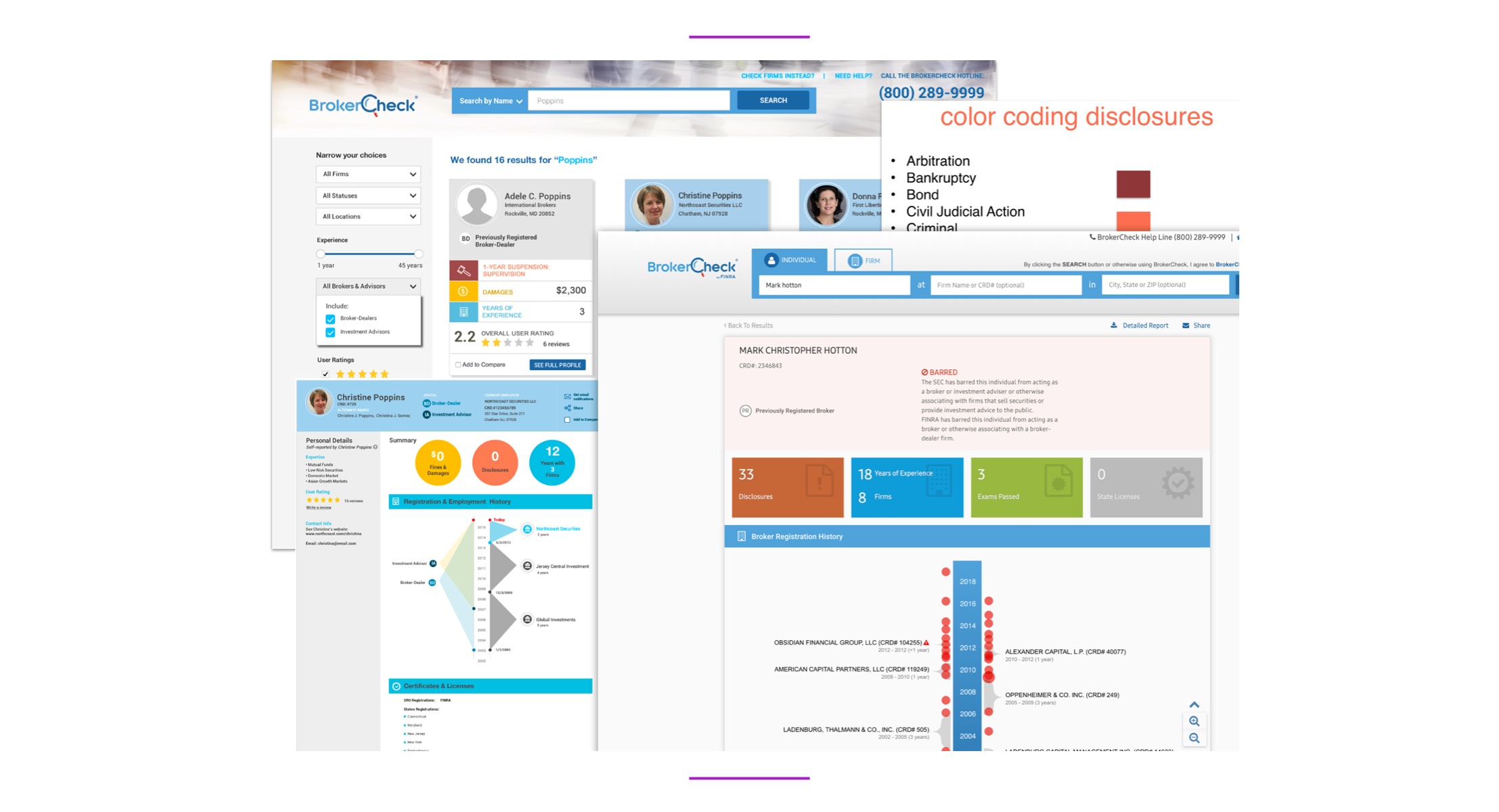
Users tasks analysis and prioritizing goals allowed us to understand how to solve the main user interface problems: The goals to improve the overall visual hierarchy on landing and search result pages was a top priority. Reducing a confusion in content switching in search tool between individual and firm was also a top task. From usability tasks, the critical issues that needed attention were wide unreadable lines of copy and hard to read pdfs. User interface elements as icons needed also to be reworked to provide more meaning.
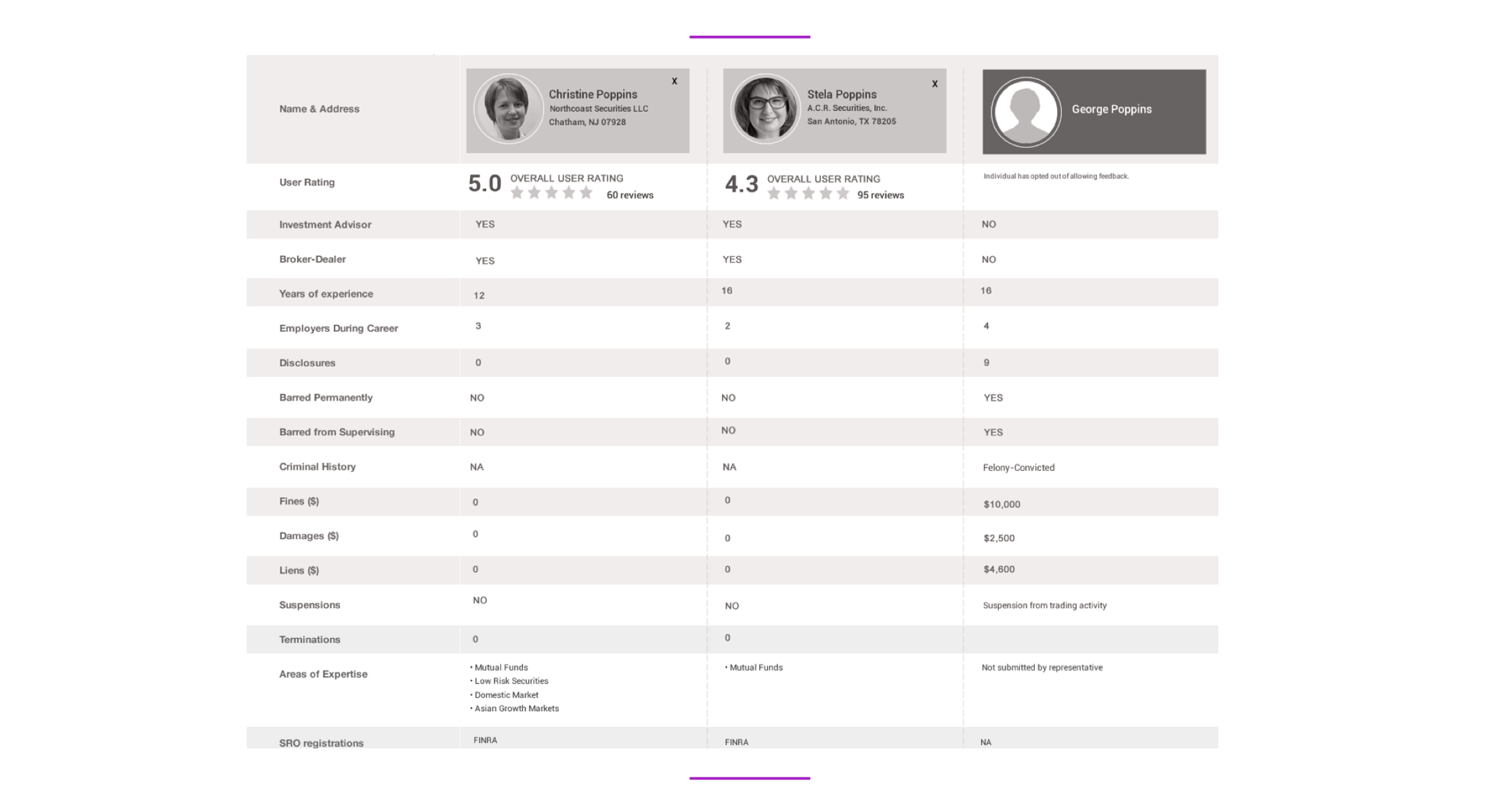
Observing users allowed us to understand how critically important it is to simplify the search tool, but present more filters for a refined search. We also had to rethink the landing page layout for easier navigation and present each profile card with the most important quick overview. We tested, iterated, tested and iterated. My initial design relied too much on color coding of the cards so in the final step we toned it down and finally received a positive feedback both from end users as well as internal users and financial professionals.
User testing revealed significant improvement in BrokerCheck search and comparisons. Additionally, repeat usage and session stickiness significantly increased.