Becoming IB School
Reimagining IB authorization as a guided, personalized and scalable service.
Transform IB service through a guided, personalized authorization school journey.
Overview
This redesign initiative was created to give schools clearer guidance on the authorization journey that is currently outdated and no longer supports the needs of schools or IB staff well. The process depends on fragmented tools, manual workarounds and inconsistent handoffs, which creates rework internally and confusion externally.
Objective
Redesign the IB authorization journey into a guided, personalized, and scalable service that reduces confusion for schools and equips IB staff with a single, consistent system for delivering timely support.
Team
1 UX Designer, 1 Content Designer, 1 Product Manager, 1 Solution Architect
My Responsibilities
- Participating in workshops documenting journey of internal staff
- Documenting personas & journey maps at various level of fidelity
- Establishing information hierarchy, navigation and object-oriented methodology principles
- Exploring various solutions through vibe coding
- Validating high-level direction through prototypes at varying levels of detail
- Designing interactive user flows to get ideas off the ground
- Currently planning: Conducting moderated and unmoderated prototype usability testing
- Currently planning: Collecting user feedback via surveys or one-on-one observations
Gathering Knowledge
My work built on earlier external research, but additional internal discovery was needed to understand how the service actually operates behind the scenes. While previous work captured school needs well, it left important backstage realities underexplored. Internal workshops helped surface staff needs around coordination, policy application, visibility and portfolio management, risk tracking, professional development forecasting - making it possible to shape a service that works for both schools and internal teams.
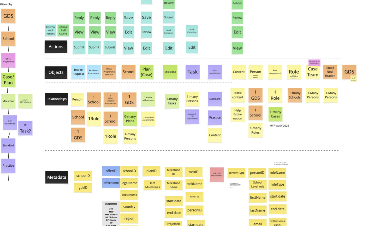
Object-Oriented UX and Information Architecture
I used Object-Oriented UX principles to help define the future structure of the authorization experience, focusing on how users would navigate the service and how information should be organized across the journey. I worked on establishing a clear navigation model and information hierarchy that could support both school needs and internal IB workflows, while collaborating closely with the solution architect to challenge, shape, and align the future product architecture. This work helped connect user needs, service logic, and technical feasibility into a more coherent foundation for the redesign.
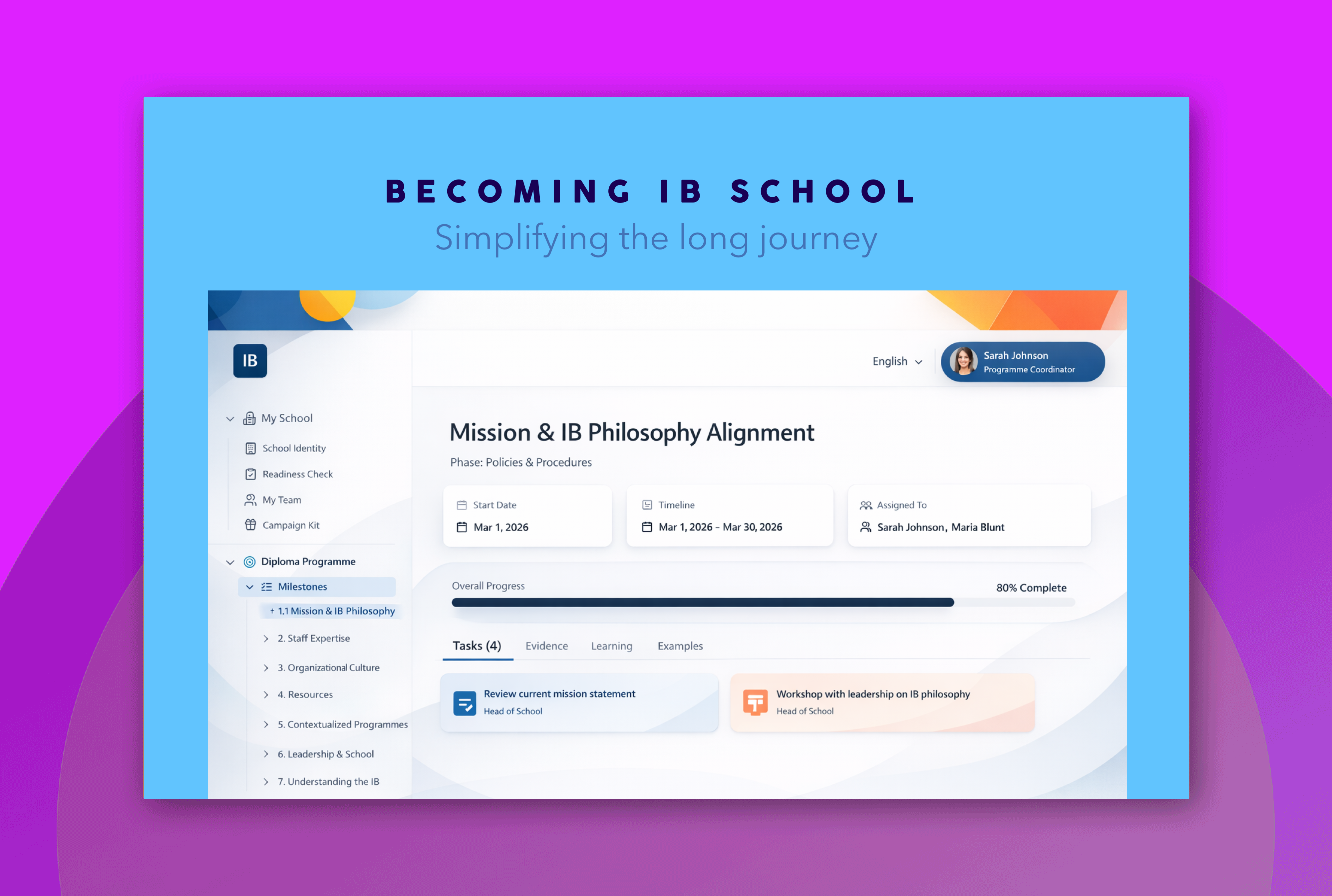
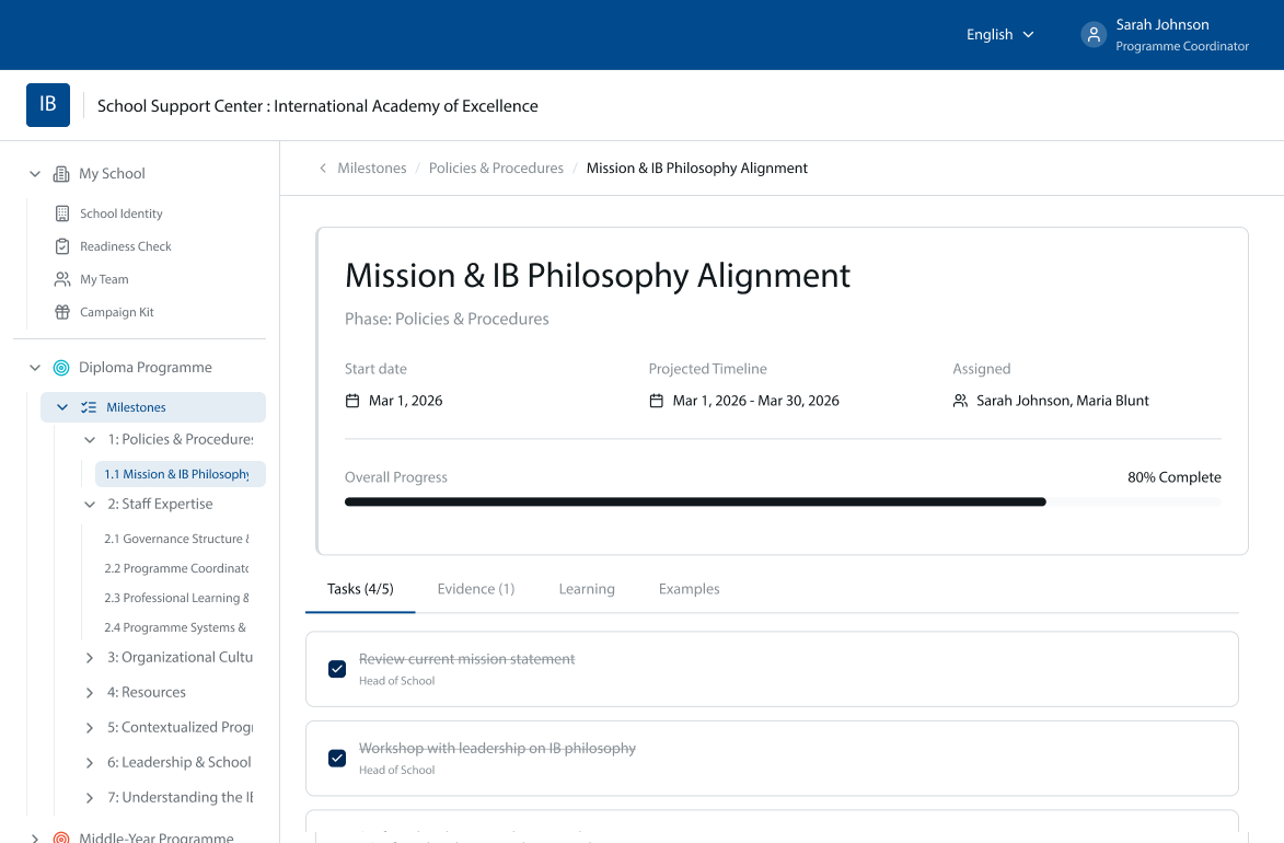
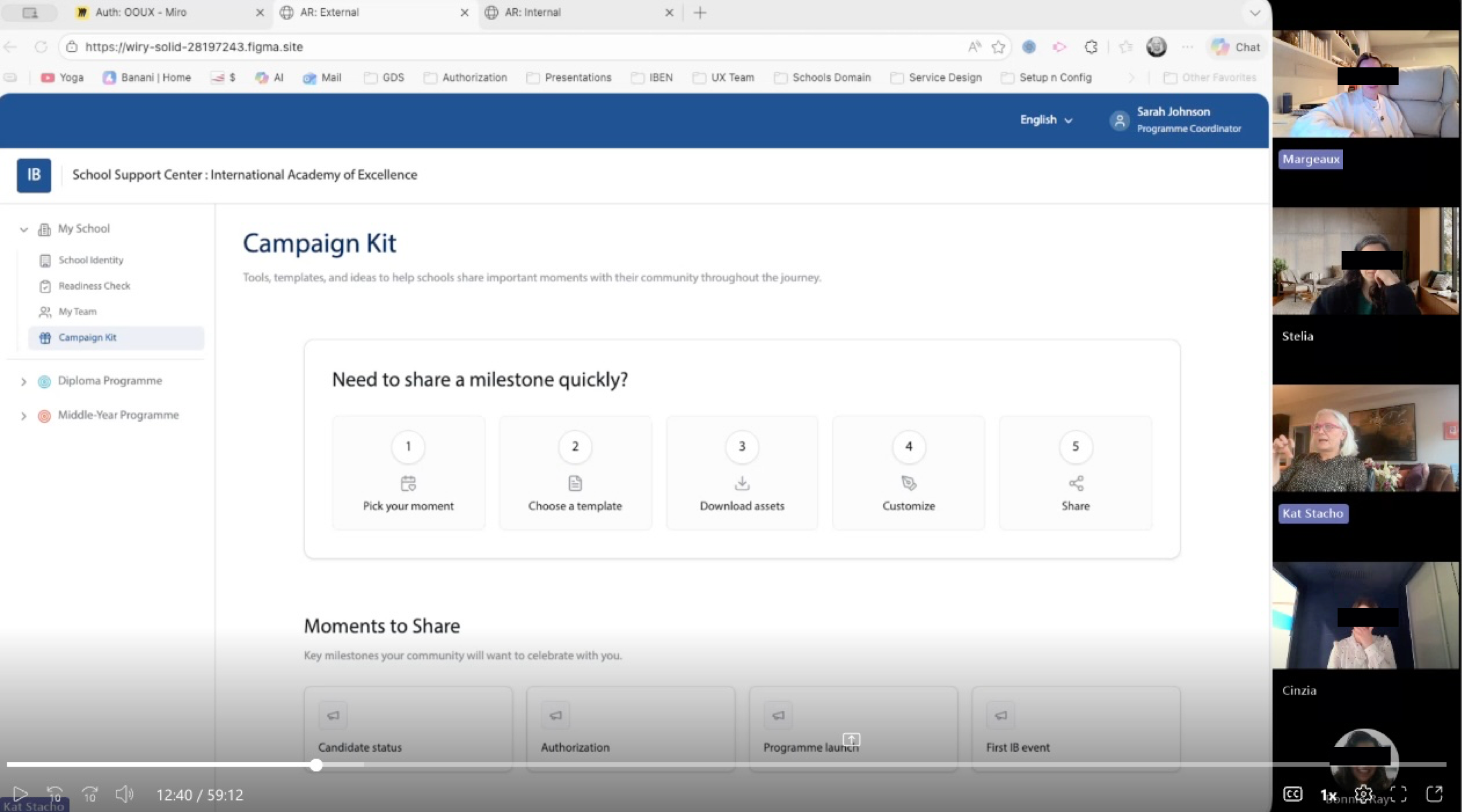
Content Template Design
Alongside defining the navigation and information hierarchy, I also worked closely with content designer and writers to shape the structure and purpose of milestone and task templates within the new platform. This meant identifying what content users need at each stage, how it should be broken down to feel clear and actionable, and how writers should craft guidance so it can be easily consumed inside a more structured, task-based experience. The work required aligning UX, content, and system thinking so that the architecture, templates, and writing style all supported one another—creating a journey where information is not only well organized, but also meaningful, consistent, and easy for schools to follow.
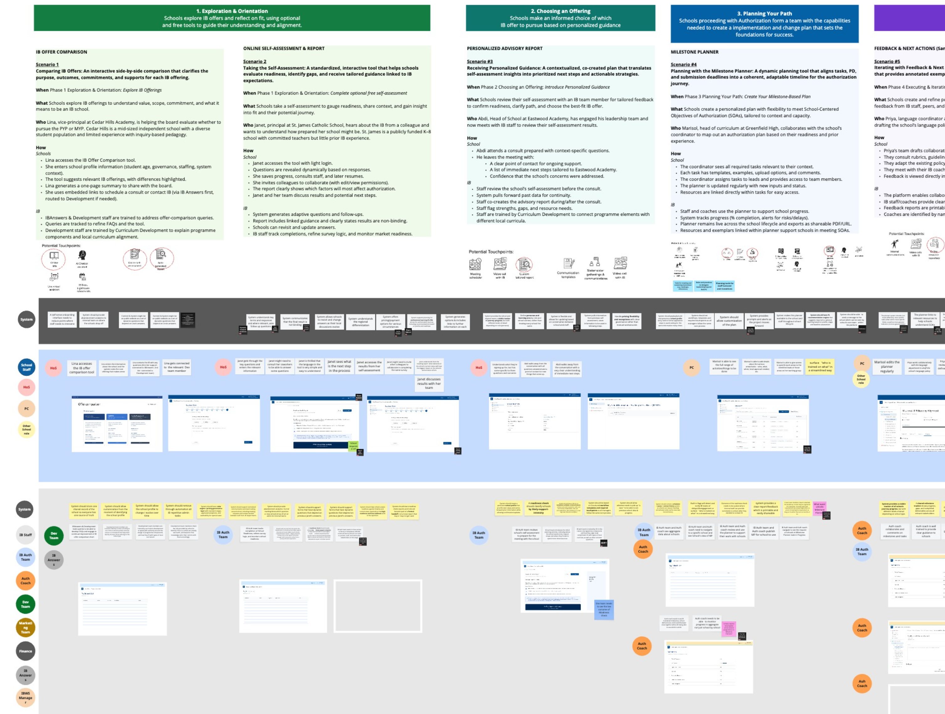
Prototyping & Testing
High-level process maps, wireframes and high-fidelity mockups were used to validate our ideas in many iteration cycles. Testing was often conducted with a smaller group of selected users through direct observing both moderated and unmoderated.A key part of the work was framing what belongs in the minimum lovable product. The MLP criteria emphasized capabilities that are essential to completing the authorization journey end to end, directly solve major pain points for schools and staff, and do not introduce unnecessary risk to consistency, quality or trust at launch. This grounded the redesign in practical delivery decisions rather than ideal-state vision alone.
See first high-level prototype in Figma Make ready to test with users.